UI Design for Officebanao's DAM Module
About
Office Banao is transforming workplace design by streamlining the process with proprietary technology. They offer a seamless, tech-driven user experience that supports effective AI-powered space planning, 3D walkthroughs, extensive product choices, and real-time collaboration for quick decision-making. With transparent pricing, multi-vendor services, and real-time delivery updates, they simplify execution and shorten project timelines.
Task/Objective
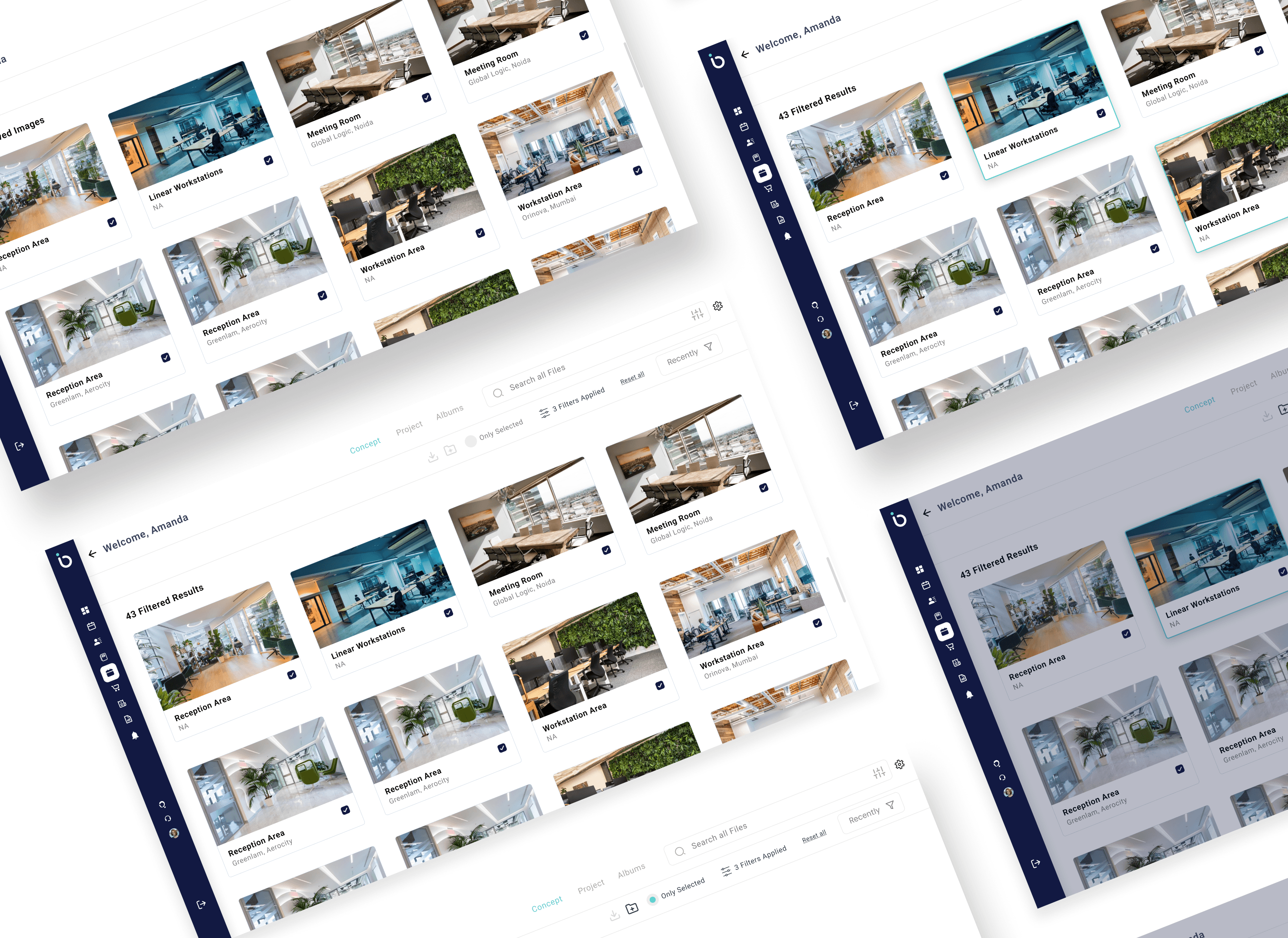
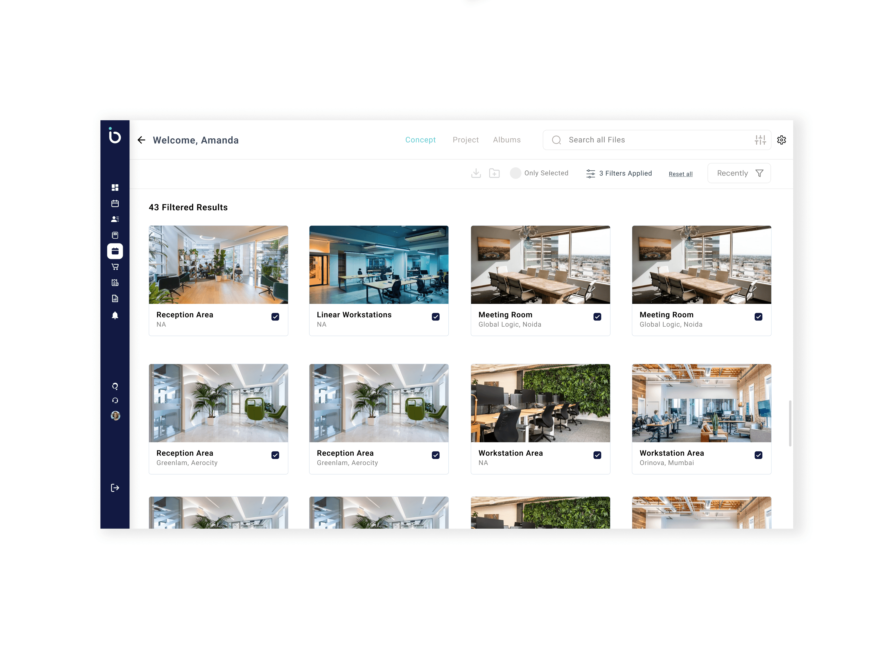
At Officebanao, managing all our digital assets—like 3D renders, floor plans, and marketing creatives—was becoming a mess. Teams were spending way too much time searching for the right files or re-creating lost ones. We needed a clean, efficient system to store, organize, and share assets easily. That’s when we decided to build a dedicated Digital Asset Management (DAM) module. I led the UI design for the entire module—planning intuitive layouts, creating reusable components, and ensuring the experience felt seamless for every kind of user, whether they were designers, marketers, or vendors.
Gurugram, Haryana
2006
Real Estate
$6.26 million (2024)
200+
Challenge
One of the biggest challenges was balancing speed with consistency. I had already built a custom design system from scratch for Officebanao while working on other critical modules—starting with the onboarding journey. So when it came to the DAM module, I had to make sure the UI felt like a seamless extension of the larger product ecosystem. This meant reusing and adapting components wherever possible, while also introducing new patterns tailored to complex asset types like 3D files and floor plans. Designing for multiple user types—internal teams, external vendors, and collaborators—added another layer of complexity in terms of access control, clarity, and ease of navigation.
Results
The DAM module turned out to be a game-changer for the Officebanao team. With the new UI in place, teams could find and share assets way faster—what used to take minutes (or sometimes hours) now took just a few clicks. The consistent design language made the entire experience feel native to the platform, and internal adoption was smooth since it followed familiar patterns from the onboarding module. Different teams—from sales to marketing—started using it daily without needing walkthroughs or training. It also helped reduce redundant asset creation and brought more structure to how we stored, tagged, and accessed files. Overall, it saved time, reduced friction, and scaled effortlessly with growing asset volume.
35%
Improved onboarding process
25%
Increase in user retention
84%
Increase in time spent on website
Process
1. Understanding the Problem
I started by syncing with key stakeholders across teams—marketing, design, operations, and sales—to understand how they currently managed digital assets and what their biggest pain points were. Most teams struggled with locating the latest assets, organizing files across departments, and maintaining consistency in usage.
2. Mapping the User Needs
Based on internal interviews and use-case mapping, I identified the core user types: internal designers, marketers, sales reps, and external vendors. Each had different needs—from uploading and approving creatives to simply viewing or downloading files with restricted access. This helped me define primary user flows and permissions logic early on.
3. Leveraging the Existing Design System
Since I had already created a scalable design system for Officebanao, I used that as the foundation. This ensured visual consistency across modules and allowed me to move faster with reusable components like buttons, modals, filters, and cards.
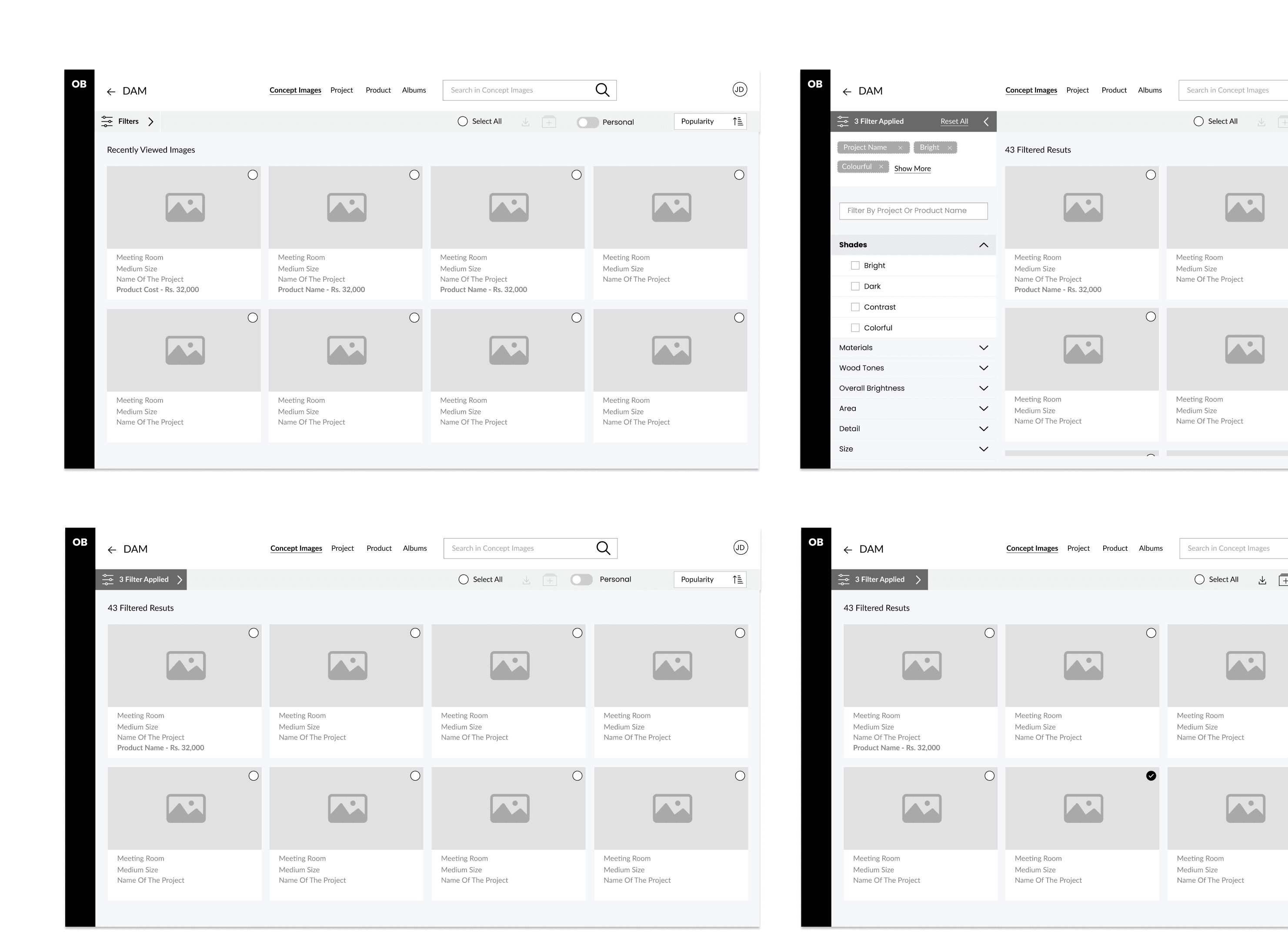
4. Wireframing & Prototyping
I sketched out the main user flows—uploading assets, tagging and categorizing, browsing via filters, previewing content, and managing versions. Low-fidelity wireframes were reviewed with stakeholders before moving into high-fidelity prototypes using Figma.
5. UI Design & Micro-Interactions
I designed a clean, modular interface optimized for speed and clarity. Special focus was given to asset previews, drag-and-drop uploads, tag management, and smart search filters. Micro-interactions were added for better feedback and smoother transitions.
6. Collaboration with Devs
Once the designs were locked, I collaborated closely with the dev team for handoff, clarifying edge cases and adapting the UI for real-world constraints. Weekly check-ins helped keep alignment across sprints.
7. Internal Testing & Feedback
We soft-launched the DAM internally and gathered feedback from frequent users. Minor tweaks were made to improve tagging experience, search performance, and the empty state UX.
Conclusion
Designing the DAM module for Officebanao was a true test of scaling design thinking across a growing product ecosystem. Balancing usability with complexity, and consistency with flexibility, taught me how powerful a well-structured design system can be when applied strategically. Leading the UI while simultaneously working on other core modules like onboarding helped me approach this with a holistic mindset—ensuring the experience felt cohesive and familiar to users across the board. The positive adoption and impact on team productivity validated the design decisions made, and the project reinforced the importance of designing not just for the interface, but for how people work. It was a solid reminder that great UI isn’t just about aesthetics—it’s about clarity, efficiency, and trust.
Dive into the full case study using the link below: